Color Management
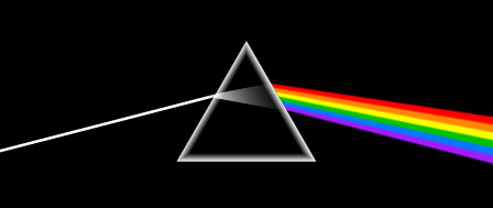
Color is the range of electromagnetic energy that is visible to the human eye. All colors are actually composed of white light which, as discovered by Sir Isaac Newton, would split into its respective hues when passed through a triangular piece of glass called a prism.
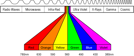
In scientific terms, the higher the frequency of the colour, the closer together the waves of energy are. Wave frequency is measured in nanometers, or billionths of a meter. As you can see, visible color represents a small fraction of energetic waveforms.
Measurement of Color
Color is defined by the following properties:
- Hue = the name of a color such as red, violet, or blue.
- Value = the lightness or darkness of the color. Tint, shades and tones are created by the addition of white, black and gray, respectively.
- Saturation = the intensity of the color such as bright or dull. Saturation is also known as intensity or chroma.
By these definitions, black and white do not qualify as colors. They are actually values best described as the presence and absence of visible light.
Additive Color
Color reproduction on the computer monitor (and on television) is achieved by combining Red , Green , and Blue light (RGB) in varying levels to produce a full color image. This is defined as an “Additive Color Process”, because when the colors of light are added together, the result is an increase in light intensity.
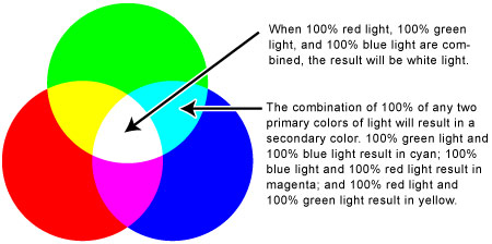
When two primary colors of light are combined, a secondary color is produced. If all colors are present in full intensity, the result is white. If none are present, the color is perceived as black. .
Subtractive Color
The combination of the primary colors in varying degrees is what creates the illusion of a full color image. This is defined as an “Subtractive Color Process”, because when the colors of ink are added together, the result is a decrease in light intensity.
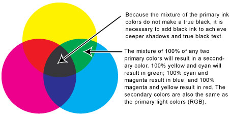
Cyan , Magenta , Yellow , and Black , (CMYK), form the basis of the four-color printing process. The “K” is used to signify black to avoid confusion with blue. The addition of black is necessary to create the darkest hues, deepen shadows, and produce a true black text.
NOTE: Undoubtedly some art students are scratching their heads wondering why we say primary colors are not red, yellow and blue. Printers have known for decades that this color model, standardized in 1613 by French mathematician François d’Aguilon, is largely outdated and a more complete, vibrant range of colors can be produced with cyan and magenta instead of red and blue.
Color Schemes
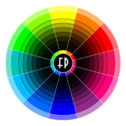
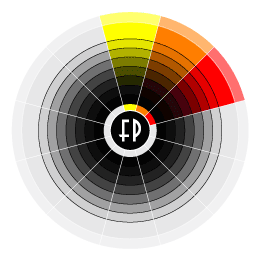
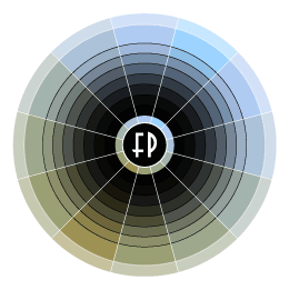
The Color Wheel
This is an ideal tool for mapping out color relationships. Click on the links above to view some basic color schemes.
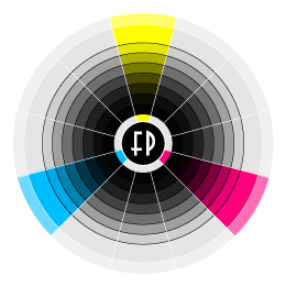
Primary Colors
As we mentioned before, these colors (Cyan, Magenta & Yellow) are the fundamental building blocks of all other colors in a printing model.
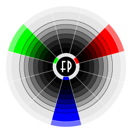
Secondary Colors
These colors are produced by mixing equal parts of two primary colors. Those of you who are paying attention will notice that that secondary colors of subtractive model also happen to be the primary colors of the additive model (Red Green & Blue).
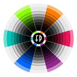
Tertiary Colors
Tertiaries are produced when primary and secondary colors are mixed in equal portions.
Analogous Colors
These are colors which are within a similar range. Think of them as a family of related hues.
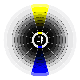
Complimentary Colors
These hues are complete opposites. When put next to each other, their contrast and intensity is amplified. Mixing a color with its opposite will desaturate its color. Equal portions of complimentaries will result in a neutral gray.
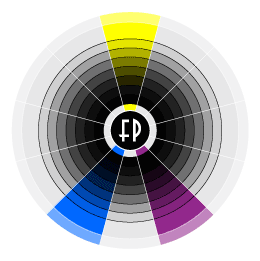
Split Complimentary Colors
A split complimentary connects the adjacent hues of a colors compliment. The resulting color schemes are harmonically balanced to place added emphasis on the original color.
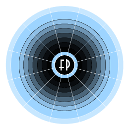
Monochromatic Color
This occurs when you use only one color throughout your composition in various tints, shades and tones.
Duotone
As the name implies, a duotone is a composition made up of two colors in their various tints, shades and tones.
- The Color Wheel
- Primary
- Secondary
- Tertiary
- Analagous
- Complimentary
- Split Complimentary
- Monochromatic
- Duotone
Color Gamut
The color gamut refers to the range of colors that can be viewed, displayed, or printed. Gamuts can vary slightly among devices, such as different brands of monitors. Printers vary drastically in their gamuts, especially if they use different technologies or papers.
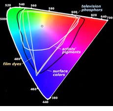
The items in the list below are arranged from the greatest to the least in terms of the range of colors that each is able to reproduce:
- Human Eye
- Photographic Film
- Television or Computer Monitor
- Digital Printing Equipment
- Offset Printing
Color Management System
A color management system can be broken down into three categories: calibration, characterization, and conversion.
Calibration: Calibration is the process of tuning a device to a known or defined standard to ensure that it handles colors accurately. It should be performed quite frequently, on some devices more often than others.
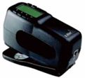
Characterization: A process that defines the color gamut of a specific device. A spectrophotometer (pictured above) is used to measure color samples and create the necessary color profiles.
Conversion: Maps the color gamut of one device to that of another and makes the required changes in order for both devices to produce a similar color range. This is also known as gamut mapping.
Color Software Utilities

One option for color management is Apple’s ColorSync software. All industry standard programs (Adobe, Quark, etc) support ColorSync, which is supplied free with every copy of Macintosh OS.
ColorSync is a standard for managing color in cross-platform workflows. Microsoft Windows (Versions 98 and later) contain ICM2, which is Microsoft’s first capable color management implementation.
Color Devices
Scanners

Scanners are easy to calibrate, but you need a different ICC profile for each type of original, such as one for reflective copy, transparencies, slides, etc.
Generally, an IT8 target is scanned and compared to the target values. A corrective profile is created and when an image is scanned, the color is corrected on the fly.
Monitors
Since their color gamut is most unstable, regular calibration and consistent viewing conditions are very important. To optimize the monitor, make sure you are creating the ICC profile in the ambient lighting conditions in which you will be using the monitor.
TFT and LCD monitors are becoming more popular due to their small footprint, but they still cannot match the rich color gamut provided by classic CRT monitors.
NOTE: For utmost control over your monitors, it’s best to have an external calibrator, such as a colorimeter, used with calbration software.
Output
Using color management with a printer or press is very challenging. Different paper stock with different colors or finishes all influence the way color appears. Considerations must also be made for the total ink limit (TIL), Under Color Removal (UCR), and rendering intent.
Maintenance
Your profiles must be checked often as several variables can change affecting your color. The stability of each device in a color-managed chain can dramatically affect the whole system and good quality control is essential.
Color Considerations
- The type of paper on which color is printed has a huge affect on color. The ink absorption rate, along with the brightness and the color of different papers can affect color appearance.
- There can be differences in ink pigments between different ink manufacturers. To keep consistency, most printers use ink from one vendor.
- Differences in time of day and in artificial illumination greatly affect the appearance of ink color. A color viewing booth must be used in order to accurately match the printed color with the proof.
Spot Color
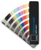
Spot (or PMS) color is usually considered to be any color used on a document that is not a process color. These are often used to create special effects or to meet a company’s branding standards with consitent color.
Specialty inks can also be used as a spot color to provide even greater emphasis to a print. These inks can range from fluorescent, fade resistant, opaque, and metallic inks.
NOTE: Color guides tend to fade over time, making them valid for about a year.
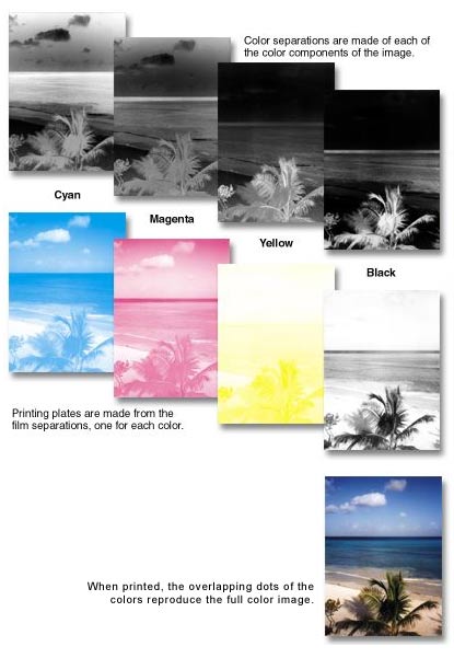
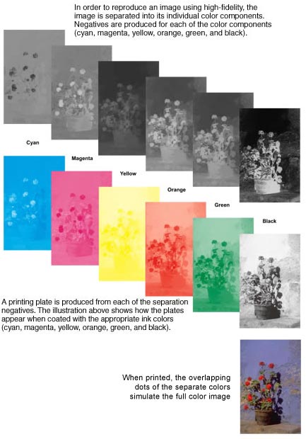
Color Separations
In order to reproduce or prepare a full color image for printing using four process colors, the image must be divided into the individual subtractive primary color components. There are various methods of separation.
- Photographic Separations: Using a large process camera, a full color image is converted into halftone negatives. The four halftone negatives (C,M,Y,K) are known as “Color Separations”.
- Indirect Photographic Color Separation: The original image is separated into the individual primary color components and used to prepare analog plates for traditional printing methods.
- Electronic Separations: The image is scanned and converted into a digital record can then be imported into an image editing software program where the color separations can be produced with the click of a mouse.
Screen Angles
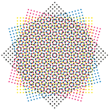
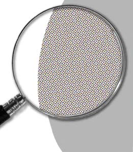
The rows of dots on the screens used for each color separation must be positioned at a specific angle so that the printed dots do not form a distracting pattern.
The angles are: 45 degrees for black, 75 degrees for magenta, 90 degrees for yellow, and 105 degrees for cyan. The angles form a rosette pattern, which is merged into one continuous tone by the human eye.
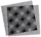 If the screens are positioned at the wrong angles and then printed, the rosette pattern will not be correct and a moiré pattern appears, which results in an image that no longer has a smooth gradation of color.
Dot Gain
Dot gain occurs when the size of the halftone dot increases due to several variables. If the size of the dot increases too much, then the image and colors print darker than what was originally intended. Some of the variables that affect dot gain are:
- Prepress – if the negatives from different sources are duplicated to produce the final film, the dots may increase in size.
- Printing Equipment – the type of press, the age and condition of the equipment, and press settings may determine the degree of dot gain.
- Ink – ink is not the same from all manufacturers. Inexpensive or low-grade ink is more likely to cause dot gain problems than a higher priced, high-quality ink.
- Paper – Different papers cause ink to absorb and spread differently at different rates. It is always best to consult the print provider when determining which paper is best suited for a particular application.
Registration
Registration simply means the alignment of color separations:

Several factors can cause the individual colors of a four-color image to become misaligned, which results in gaps and color shifts between objects. Some of these factors include:
- Prepress – negatives may be produced correctly or they may become stretched, resulting in the separate colors not registering correctly when printed.
- Plates – improper plate and/or blanket packing on the press can affect the image on the printing plates. The plates can also be improperly installed on the press resulting in poorly registered colors.
- Paper – occasionally, paper stretches and distorts when it absorbs moisture as it passes through a printing press. The stretching and distortion of the paper may result in poor registration of the individual colors.
Trapping
Trapping can help compensate for registration problems by slightly expanding one color into another and eliminating the gaps and color shifts between colors.
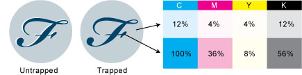
The sequence in which the process colors are printed also influences ink trapping. For standard four-color printing, the correct sequence to print the process colors are black, cyan, magenta, and finally yellow.
High-Fidelity Color Printing
High-fidelity is a method of color printing that utilizes additional process inks to produce a greater range of color on the printed piece. There are many different versions of high-fidelity printing, but they all use conventional or enhanced versions of CMYK inks plus additional colors to increase the color gamut.
An important point when considering the use of high-fidelity printing, is the fact that the process requires a press with five or more printing units and more preparation time, which makes the process more expensive than a 4-color process.
Printing a high-fidelity application digitally can be less expensive than with conventional printing depending on the quantity.
Dithering
Dithering simulates the colors from the original 24-bit image that are not available in the reduced palette of the 8 or 16-bit system.
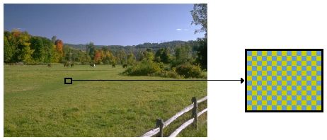
This graphic illustrates the concept of dithering. The green color in the rectangle on the photograph at the left does not exist in this computer’s 256 color palette. The blue and yellow pixels are so small and close together that the eye will merge them and see green.
NOTE: While dithering is useful technology for screen presentation, it is recommended that all prepress work be conducted on a system with 24-bit color depth (millions of colors) to provide the best accuracy.