As a printer and artist, or perhaps an artist who prints, both titles seem to encompass my craft. CMYK has become my palette, allowing the interplay of pigments in print across various materials to serve as my canvas for any artistic endeavor.
My primary goal is to achieve the quintessential representation of color for my clients. As a color theorist, I pursue excellence in catering to their vision and in exceeding their expectations, while also fulfilling my own artistic perception of how colors should coalesce.
I do not consider myself a conventional artist, however I undoubtedly share the passion all artists have for the vibrancy and dynamics of color. Their work exemplifies the emotional potency of color, an aspect which I aim to reflect in my work.
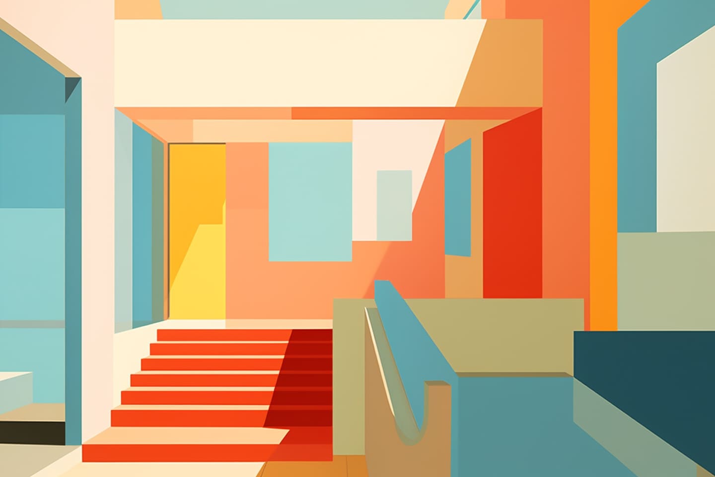
The Color Wheel of Life
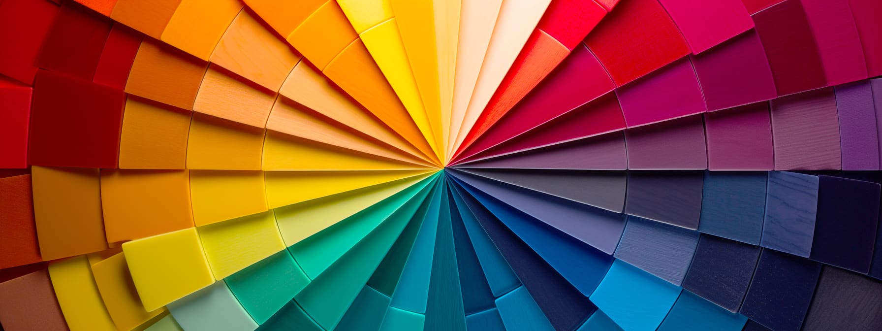
The principles of Color Theory, as presented by luminaries such as Josef Albers, are what guide and influence my practice. Their core tenets remind me that perception is subjective and that color interaction is a dialogue, not just a visual impression. Albers was a firm believer that color deceives continually; thus, in my work, I chase the elusive perfection of color harmony. The interaction of colors is akin to an ongoing conversation across a spectrum, rather than a static or binary encounter.
The pursuit of color harmony has become an engrained response for me, extending far beyond my profession. It applies to daily choices, such as the selection of clothing, accessories or decorations. It is in these personal spaces where where color reflects our individuality. Years of internalizing the relativity and malleability of color, have also helped me instantly recognize and find kinship with anyone who has curated their palette of self-expression.
A Song of Colors
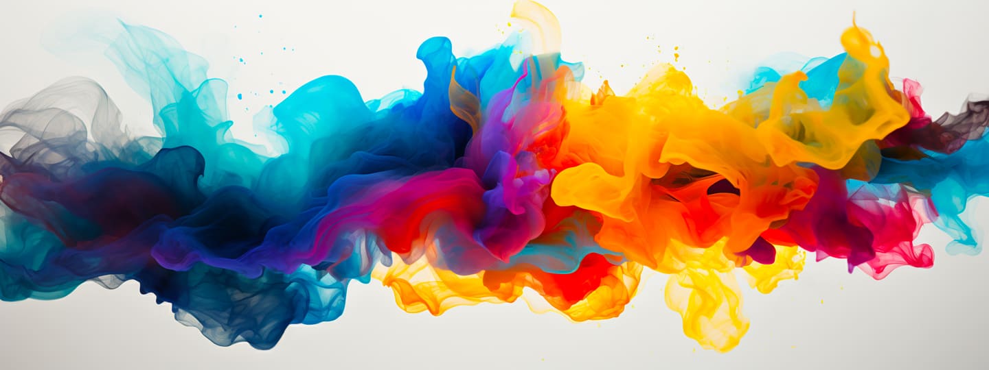
Choosing colors for a print project or picking out an outfit involves intrinsic creativity. It is an inherent art form, a continuous interplay with every shade and tint transforming perception. This selection process is much like composing music or writing poetry — there’s a rhythm to the pairing, a lyricism in the narrative that emerges to provide a visual soundtrack to the emotions and narrative of the intended creation.
Chromatic Energy
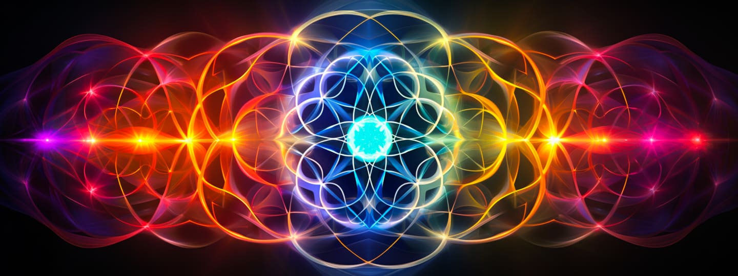
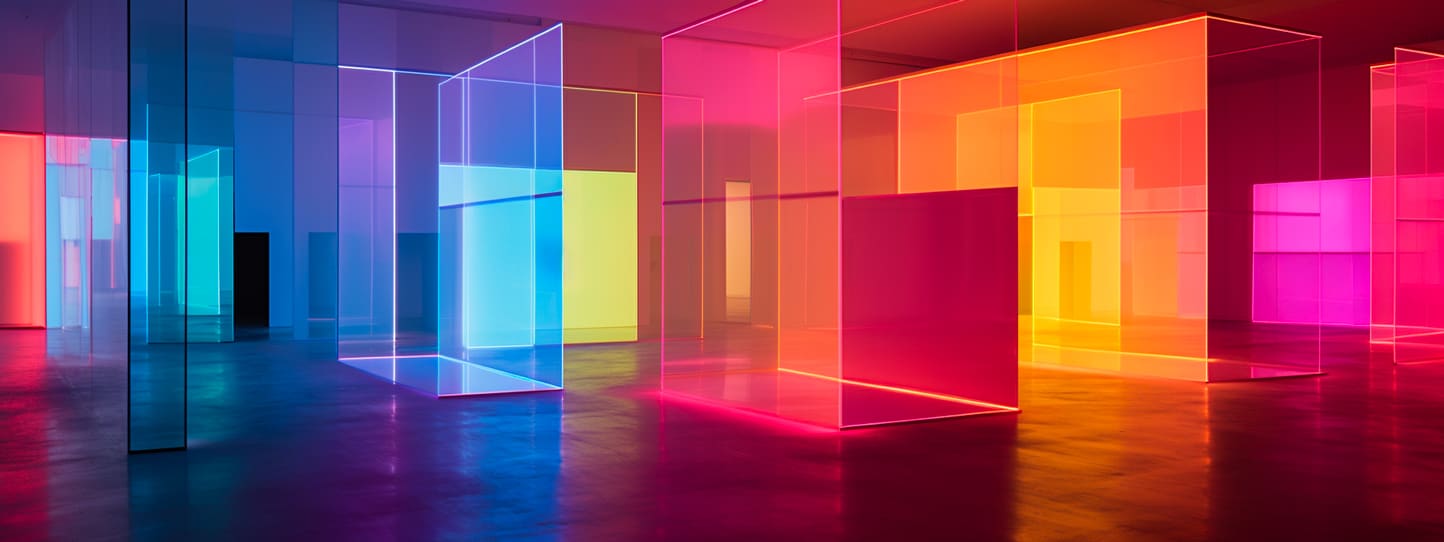
My fascination with color transcends the mere aesthetic, verging on the spiritual. I perceive color as a dynamic, living force that performs a vibrant dance right before our eyes. Watching colors interact is a profound experience; they mingle and converse in a silent vernacular, conveying emotions and stories in a vivid and eloquent narrative.
This composition of hues unfolding before me strikes a chord deep within, the way colors blend and contrast, the way they influence each other and change character depending on their context, speaks of a deliberate arrangement orchestrated by nature’s unseen hand, as if by design, each color has been endowed with a specific purpose.
The harmony among them suggest intention, not a trivial result of randomness or chance. It just feels more like an artist’s conscious choice that we are privileged to observe. Our perception of color is a dynamic interaction, deeply intertwined with light and the angle of vision not to mention the subjective nature of perception itself.
Color Mastery

Leonardo da Vinci’s masterful application and use of chiaroscuro in the “Mona Lisa” are prime examples and testaments to his genius. He knew how light could sculpt color, creating a lifelike presence that engages the viewer’s gaze, allowing the colors and tones to shift subtly with each change in focus and perspective.
Printers seek to harness this mystical conversation between colors and the way light reveals their true essence. We aim to create prints that do more than replicate images; we aspire to emulate da Vinci’s sensitivity to light’s transformative power over color, offering an experience that shifts with the observer’s engagement, just as the Mona Lisa’s smile seems to change with our attention and the light around her.
Modes, Moods and Spaces
Understanding the technical nuances of color spaces is critical, including the differences between RGB (Red, Green, and Blue)—the colors we see on our monitor/phone/computer screens — and CMYK (Cyan, Magenta, Yellow, and Black), which is the standard for print production, as well as solid mixed pigments like Pantone Ink Colors.
Working within these different color spaces is akin to operating in three distinct print shops or art studios. Many colors visible in RGB cannot be replicated in CMYK and vice versa. Furthermore, Pantone colors must be translated into a symphony of CMYK values. Understanding these distinctions, applying them with skill, and producing work that not only meets but also surpasses client expectations is what we aoim to achieve. We have dedicated over two decades of perfecting our craft and treating the craft of printing as an art.