Mastering Press Proofs to Recreate Wallpaper
Learn all about press proofs and their role in establishing quality control and accurate matching both colors and materials of old wallpaper designs.
 By Joseph A. Gornail
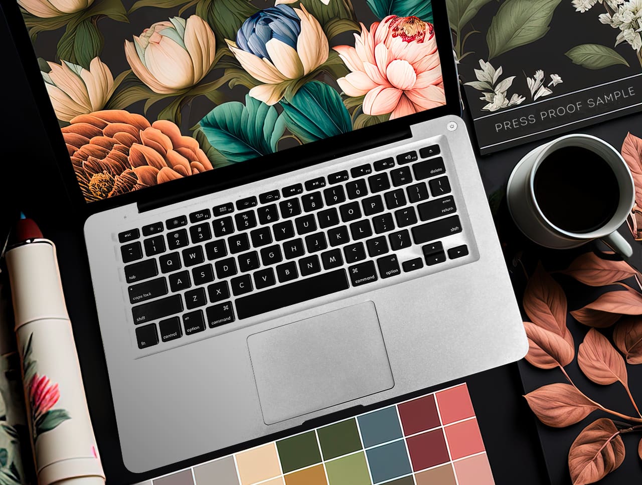
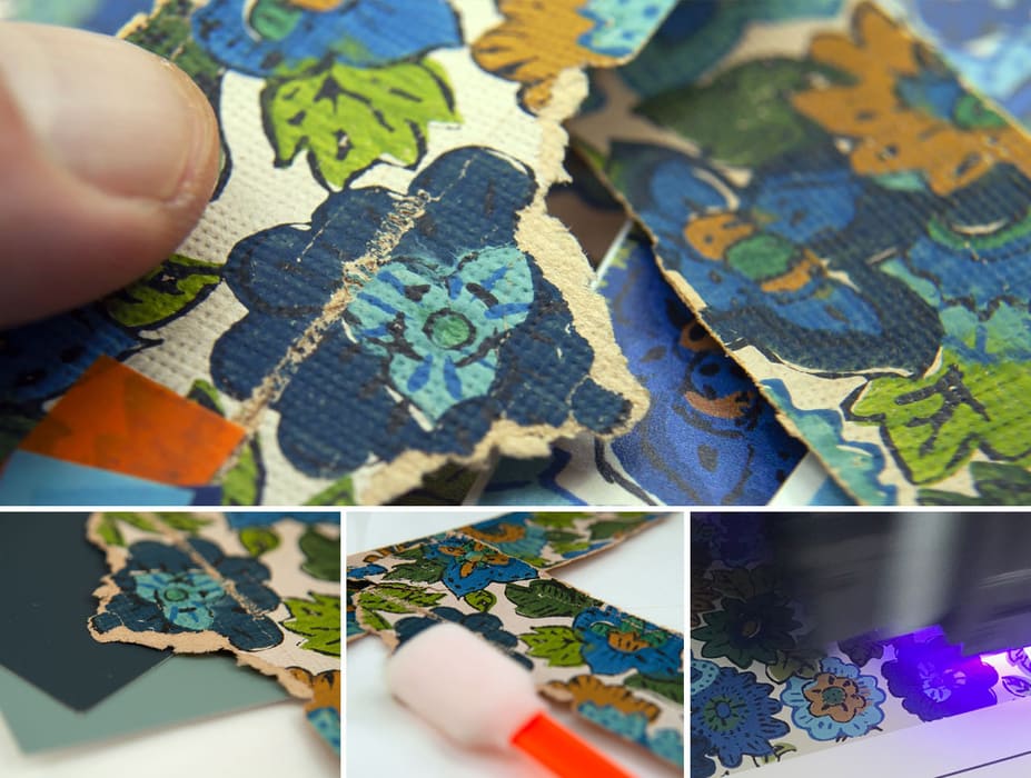
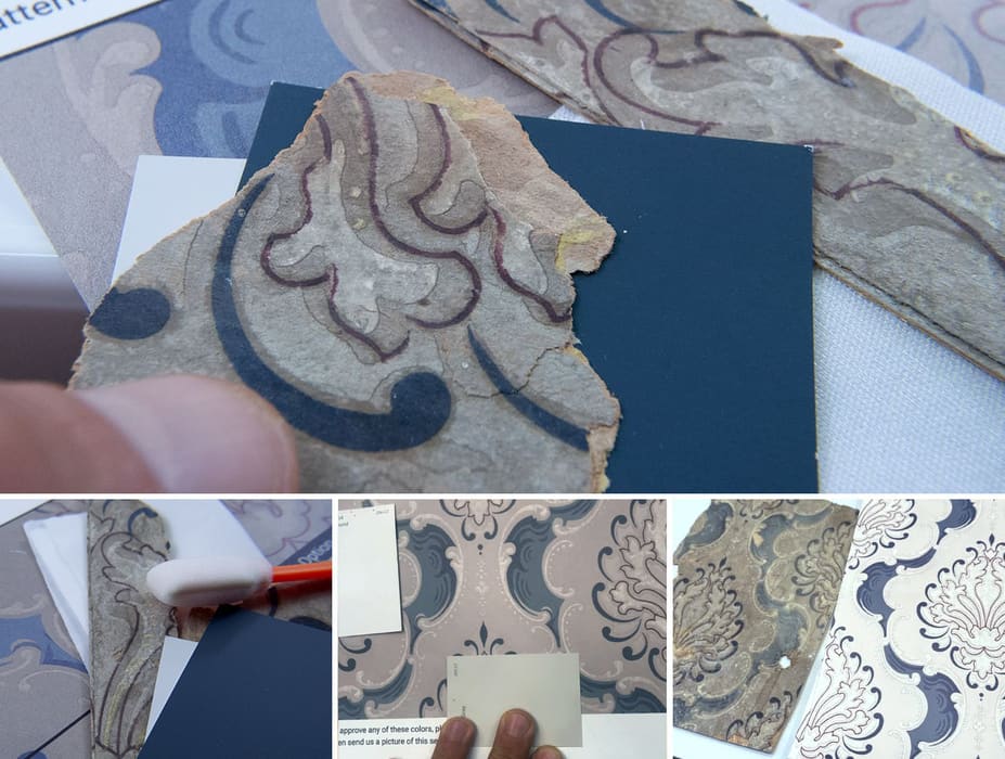
One of the greatest challenges we face is matching existing wallpapers from other decades. The colors, the methods, the materials, the process - everything was different back then. But we’re up for the challenge. Our team of artists and craftsmen carefully examines each original sample, analyzing every detail of the design to develop a plan to faithfully reproduce its characteristics using newer digital printing techniques and modern wall coverings.
What Is a Press Proof?
Our own decades of experience have taught us that wallpaper reproduction is not just about printing a design onto paper, it’s about capturing the essence and spirit of the original work. There is no process more vital to this pursuit than the humble press proof. For the unfamiliar, a press proof (or sample proof as it is sometimes called), is based on a simple concept - people should not have to pay for something in great quantities without seeing how a small sample of it looks first. You get an accurate, printed preview of your final roll for minimum investment, allowing you to correct any errors in color, layout or image quality.
Our Experience
When we first started printing wallpaper in 2006, we quickly identified color matching as the front line of quality control. Our Bible for attaining accuracy was Josef Albers’ “Interaction of Color” (1963). We learned very quickly that the same exact hue might feel different depending on neighboring colors on a print or even colors of adjacent walls. It forced us not just to consider the wallpaper itself but its environment and the distribution of light.
As demand for reproducing wallpaper began to rise, we encountered many unique technical challenges, along with a shift in client demographic. There was an influx of homeowners and contractors and we realized that, while we can do this in our sleep, the process is often not as straightforward or approachable to everyone. It forced us to fine tune our proofing process to the unique task of wallpaper replication.
On one particular project where there was existing wallpaper to match, a very costly mistake was made. The final colors of the wallpaper did not match the existing installation, because the installer had looked at the press proof in poor lighting conditions. Without a neutral light source, the hues were shifted from their actual tones, and the job had to be reprinted. It was an expensive, yet effective lesson for the third party installer, on the level of transparency and communication which is required at every phase of this process.
Impeccable Proofs:
A Recipe For Success in Wallpaper Replication
A press proof, when executed correctly possesses certain characteristics:
- It is printed at actual size, to accurately reflect image quality and sharpness
- It is printed on the exact material from the final rolls, leading to greater consistency and no surprises.
- It is trackable. There should be codes, dates and signatures from press managers to show accountability.
- It presents alternatives for colors as the matching can be the most challenging aspect.
- Is accompanied by clear, straightforward instructions and disclaimers to eliminate misunderstandings.
- It is printed on presses which are calibrated regularly to ensure consistency in color and ink coverage.
If even one of these variables are missing, it can either drag the entire process out, or keep it from seeing the light of day. By adhering to these standards, we cut production time in half while avoiding many of the common pitfalls that come with any type of historic restoration. It’s a little extra effort up front but it pays dividends in the long run when the job goes smoothly because all the right boxes were ticked.
Nobody’s Perfect
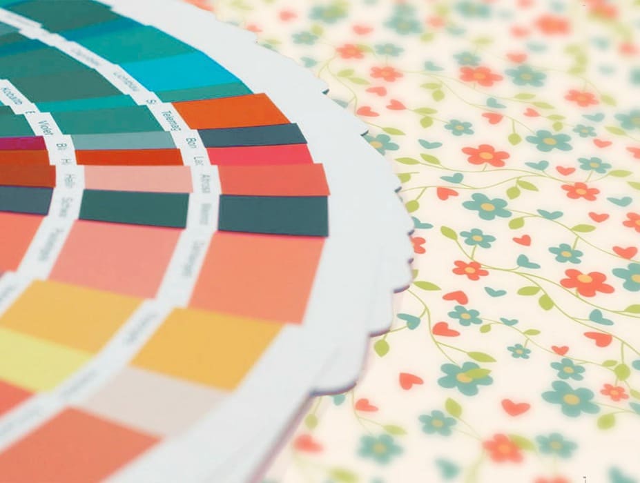
Even the best proof can miss the mark on a first attempt, especially in regards to colors. If your printer is really good at what they do, they just might nail it on the first go, but it usually takes 2-4 tries. We’ve managed to reduce this significantly by offering people a wider spread of colors from the start. We also encourage the use of standardized color systems like Pantone, Sherwin Williams and Benjamin Moore. These are valuable tools when trying to match either an old print, the color of an adjacent wall or some sort of textile/furniture.
Even under the best circumstances it’s important to keep in mind that digital wallpaper production uses different processes and inks than traditional methods. We covered this topic in our sister article Reproducing Historic Wallpaper
Some limitations of the Digital CMYK process:
- No metallic, fluorescent or solid-color inks
- Pantone matching is close but not exact (CMYK is not the same as a solid ink)
- No raised ink textures, the finish is completely flat or takes on the texture of the printable wall covering.
- Old inks may have colors which cannot be perfectly replicated with newer, UV-based inks
Aside from these limitations, digital printing presents a flexible and consistent solution for replicating vintage wallpaper, in small or great quantities. This allows us to adjust artwork based on our own assessment of the proofs along with any feedback from the client before finally going into production.
In many ways the very idea of imperfection is baked into the proofing process. It gives us permission and wiggle room to experiment and present a full array of options so that people can make informed decisions about their wallpaper recreation, every step of the way.
How Much Does a Press Proof Cost?
The cost will always depend on the size of the proof, the chosen material, along with any prepress design time required to produce the sample. Every job is different so we always collect data, parameters and artwork before making any quotes. As a policy, when you start your printing order with a 50% deposit, the proof cost is credited toward it. In our experience, people are relieved to know that this process is in place, even if they pay a little more for it, the truth is that you can’t put a price tag on peace of mind.
Why It Matters
We’ve never met a client who wasn’t excited about their project. It could be a sentimental thing - perhaps a pattern from fond childhood memories. It could just as easily be the backdrop of a film set, where historical accuracy in decor as vital to the atmosphere as the costumes.
The truth is that most of our clients have never done this before and each time the phone rings we end up fielding a common list of doubts:
“Can this even be done?”
“Will it look the same?”
“I already have a patch on my wall. Can you match that?”
“I don’t have a sample, only this picture of my grandma’s house. Will it work?”
Most of the time the answers to these questions is ‘yes’. Of course, there are exceptions due to the limitations which we already covered. The point is that press proofs are the only way to get the job done correctly. They are a guiding light through a process which is often obscured to the average person by the intricacy and technical nature that wallpaper recreation entails.
Have Your Pudding
The phrase “the proof is in the pudding” is a shortened version of the original proverb, which states “the proof of the pudding is in the eating”. The phrase means that the true value or quality of something can only be judged by experiencing or testing it, and we could not agree more.
While it is thought to date back to the 17th century, the precise origin of the phrase remains uncertain. At that time, “pudding” referred to a wide range of dishes, both savory and sweet. The phrase was used to emphasize that the only way to judge the quality of a dish was to taste it, rather than relying on its appearance or reputation. Over time, the expression has come to symbolize the true value of anything, which can only be determined through practical experience, rather than assumptions or hearsay. Like anything else in life, the true quality or effectiveness of anything can only be determined by trying it out for yourself.
While every stage of wallpaper replication comes with challenges, the longest bridge to build is always between what is seen on a screen and what ends up printed on a roll. This is where press proofs shine - there really is no other way to get it done right, than to get an actual sample in your hands. Hold it under different lights. Run your hand across the texture, check the thickness and compare it to an existing wallpaper. Test its durability. Sit on it for a few days. You might feel different in the morning.
The point is, when you’re ready to finally greenlight your project, you can do so with a particular confidence and serenity knowing that your vision has been matched and is ready to be materialized.
Summary
Press proofs are an essential tool in the production and replication of high-quality wallpapers. They provide an invaluable opportunity to ensure that the finished product meets the highest standards of quality and craftsmanship, while empowering people to achieve the results that they envisioned from day one. Accept no substitutes! If your printshop fails to insist on press proofs, run the other way. Maybe try giving us a call instead at 212.619.5446. We can talk about this stuff all day, and we’ll always provide a faithful sample of what you can expect from your finished rolls.
Questions We Hear About Press Proofs
What makes a good press proof? It’s printed at actual size, on the same material as the final rolls, on a regularly calibrated press. It’s labeled and dated, shows color alternatives, and comes with clear instructions. For a recreation, our proofs start at 12″ × 18″ but are sized to show your complete motif or repeat, so they’re often larger; a motif smaller than 11″ × 11″ is laid out to fill the 12″ × 18″ sheet.
How many rounds of proofs will I need? Often two to four for a color-critical match. We shorten that by showing a wider spread of color options from the first round. The Forest House took three rounds; a 90-year-old family damask took two.
When is the best time to judge a proof? In daylight, ideally at noon on a cloudy day, then again under the room’s artificial light. One installer judged a proof in poor light, and the whole job had to be reprinted.
Will the final rolls match the proof I approve? Yes. Production is printed to the approved, signed proof. When a client reorders, we run fresh color tests first, as we did for Glenmore Mansion a year after the original job.
What can’t a proof fix? The limits of digital CMYK printing: no metallic, fluorescent or solid spot inks, and no raised ink textures. Our article on reproducing historic wallpaper explains the differences.